Glorious Garnishes For Captivating Cocktails

Having signature drinks at your event, whether they are alcoholic or not, has become a must have for an interesting, lively affair. Signature cocktails are the epitome of fun and creativity so, the garnishes and accoutrement you use to adorn them should be something that also shows your flair, fun and festivity!

How about fruity ice cubes and cocktail stirrers for summertime drinks? Blueberries, strawberries, raspberries will all light up a lemonade or sweet tea as well as a wine spritzer!


Why not serve chocolate drinks with an extra dash of chocolate ….  Try decorating the edge of martini glasses with chocolate sprinkles for a chocolate martini. A dash of mint? Why not!


Multi-colored sprinkles add color to a wide variety of drinks from shots to fruit punch!


Vodka-soaked, chilled cranberries add zest and pizazz to a Cranberry-tini or even a simple glass of champagne!

Your guests will adore a peppermint cocktail with a peppermint garnish for a winter wedding:

candy cane cocktail winter cocktail unique cocktail wedding ideas wedding cocktails reception ideas for your wedding white cocktail winter drinks winter wedding wedding party blog

Last but, not least – make sure the glasses are the right size and shape for the drink and the garnishes. It will make all the difference in the world!

pretty-cocktails unique cocktail ideas wedding ideas wedding cocktails wedding decor reception ideas cucumber cocktail yummy cocktails unique drinks wedding party blog


-Penny Frulla for Bridal Expo Chicago

Blush Pink – A Year-Round Choice!

There are some colors that are timeless, colors that transcend theme and season, that magically work in almost any venue and seem like the decor was planned around the event instead of vice verse. Blush is one of those colors.

Blush is defined as a warm, delicate, rosy color. Definitely one of the most diverse colors in the pink family, blush can be worn by almost every skin tone from Olive to fair to African American to Asian.


Designers have been showing bridal gowns in blush for years!

Blush goes perfectly with a Victorian or Vintage themed event.

Sumptuous flowers with crystal accents create a French Art Deco mood.

Belts, table accents, shoes, jewelry and  other wedding accessories make a beautiful and delicate statement when featured in blush. This includes  desserts and cakes.

The greatest benefit of blush is the versatility. You will never find another color that is as easy to match or blend as blush, and with blush as your main color, you won’t have to worry about an accent color, since everything goes with Blush!

-Penny Frulla for Bridal Expo Chicago

Real or Fake? What’s The Difference?

“You get what you pay for”… it’s true in many cases, and we all know it.  If you have your heart set on designer gown, buying a knock-off will never be the same. Not only the designer tag, some key elements may be missing. The same goes with jewelry, shoes, and just about everything else. Here are the facts  surrounding the  real vs. fake argument.

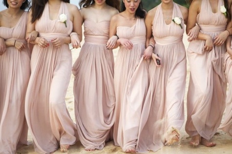
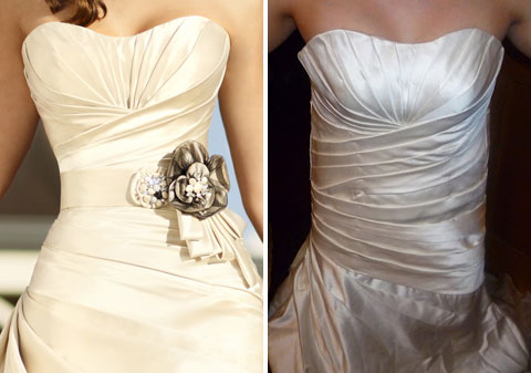
Gown– Buying a  copy of a designer gown is never a good idea. Can you spot the fake in this picture?

Headpiece– The same headpiece for less money (made poorly)  is usually a disaster. Once your hair is done, having a headpiece that is poorly made can fall apart and will most likely destroy your hairstyle.

Eyelashes – Applied by a professional individually or even in strips is fine. Doing it yourself is probably a bad idea unless you have tons of practice. Otherwise, they will look like caterpillars stuck to your eyelids. Three words: Professional makeup artist.

Hair – Even the best hair extensions can ruin your hair for a period of time. The good news it is rarely permanent damage, bad news is that it escalates permanent hair loss if you are already prone. Bad hair extensions look like hair plugs and can fall out in clumps at any time for no reason. If you decide on hair extensions for your wedding, make sure it is done professionally and short term only.


Tan – Over exposure to the sun in tanning beds and in real life has a negative affect on your skin. Self spray tans have a distinct odor and can streak or come off on your clothes plus they usually come out looking orange. The best idea if you must tan before your wedding is a professional spray tan  no less than 5 days before the wedding. Even if your tan is just perfect – don’t forget to exfoliate the day before your wedding to avoid discoloration of the gown.

A good spray tan should look like this:

Not this:

Nails – Artificial nails, either gel or acrylic can look very natural so if you break a nail shortly before your wedding, this is an excellent option. Having extra long nails when you aren’t used to them makes things difficult to maneuver but, having extra long nails applied too long before the wedding runs the risk of  breaking one or more shortly before ( or during) the wedding.

This is a suitable manicure:

As opposed to this:

Shoes – Knock off designer shoes are the absolute biggest mistake you can ever make. Your shoes should be comfortable, well-fitting and made of natural materials. Buying a copy of designer shoes in pleather is a mistake. Find the shoe that feels and fits the best on your foot without worrying about the label and you will never regret it.

Makeup – A lot of research and testing goes into cosmetics. Well, not all cosmetics. Although it may  possible to find less expensive makeup that does the same thing as a really great (probably expensive) foundation or Bare Minerals, the chances are you won’t.

At the end of the day what really matters is how you feel. If you are so bedazzled and bogged down with tips, extensions, weaves and spray tans that you are hardly recognizable or if you are so worried about designer names that the quality has become an after thought, it might be time to re-think your priorities. When it is all said and done spending a little more money for quality products may sometimes be the only option to avoid becoming a knock -off of yourself.

After all , you get what you pay for.

-Penny Frulla for Bridal Expo Chicago


A Color For All Seasons – Chartreuse!

Few colors can transcend seasons  like Chartreuse. Bold, Bright, Chic, Lively and Elegant, this is one of the most overlooked and misunderstood wedding colors!


Chartreuse  can freshen up any room and goes well with most interior decor. Bonus: It is a great color for a signature cocktail, even if your cocktail is simply Chartreuse.


 Chartreuse and Teal make a bright, bold statement when paired together.

Pinned Image


Chartreuse and Platinum make a sophisticated and more serene combination.

Pinned Image

Chartreuse and Honeysuckle is light, whimsical and well suited for a summer wedding. 

Pinned Image


Chartreuse and Ivory is elegant and chic.

Pinned Image


Chartreuse and Fuchsia is hot for spring.

Chartreuse and Plum make a luscious combination for a winter wedding.

Black and White with Chartreuse accents is the perfect choice for any season!


How do you feel about chartreuse?

-Penny Frulla for Bridal Expo Chicago

Southern Wedding Belles

The recent news of the engagement of two-time Grammy winner and American Idol alumni Kelly Clarkson to Nashville talent manager Brandon Blackstock got our creative juices flowing, imagining what kind of wedding this “Southern  Belle” might have in mind!


For the rest of the world who does not live in the Southern part of the United States, there are very distinct differences between South Carolina Style, Kentucky Style, Louisiana Style and  Texas Style. So, the fact that Ms. Clarkson hails from Texas and has planted her roots in Tennessee poses a ‘Southern Style’ challenge. However, there are some must -haves for any true Southern Wedding:

It’s all about the family. Expect to see cousins, kids, aunts, uncles and  relatives from every corner of the globe – even Yankees! The more the merrier, Southern weddings are known for being large and friendly so, when it comes to family; there is always room for more.

Grooms Cake. A groom’s cake  presents an opportunity for the bride to get creative & really WOW her groom. Since so much of the wedding is about the bride & her style, this is a great way to honor the most important man in the room.This tradition has really been embraced by people across the globe.


Beverages. Southern brides love to honor their heritage, & the quintessential beverages of the South are the great way to do so. From mint juleps & neat bourbon to sweet tea & Coca-Cola, there’s a Southern beverage to quench the thirst of young & old wedding guests alike.

Charming Accents. Glowing votives, floating magnolias, mason jars, old fashioned lanterns, parasols; all touches that remind you of a simpler era are abundant. Think of timeless elements that would work as easily in 2012 as they would have in 1954.

southern & traditions1's Wedding in Charleston

Most of all, the Southern culture is steeped in beauty, elegance, and grace. Whether your wedding is Sweet Home Alabama or Sweet Home Chicago, you can always incorporate some of these elements to make your celebration ooze with Southern Hospitality.

-Penny Frulla for Bridal Expo Chicago

Hello Gorgeous! – Emerald Is Named Color Of The Year For 2013

The Pantone Institute has issued their “Color Of The Year” and the go-to color for all things beautiful in 2013 is Emerald. I have been waiting for this for months, anticipation building, excitement growing, just knowing that December always brings the big announcement.

Allow me to explain why this announcement is so important:

Pantone is an American company that has been producing standardized color matching systems since 1963 for fashion, art, graphic design and commercial use. If you are wondering how this is relevant, think of it like this; you go to a store to buy a blouse and the ‘blue’ one really pops out at you. You are afraid to buy it because you will never find anything to match and you will be stuck wearing this blouse with a black skirt until you tire of it. Not to worry, since Pantone’s inception, they have provided color matching to designers who refer to this system to create their new lines. So, that ‘blue’ blouse is really ‘ocean blue’ and you will literally be in a sea of it at every department store. Each color and even multi-colored prints are matched, jewelry is matched and every designer has consulted Pantone to create their collection based on this color  which is found on a fan-out card system just like the ones at the paint store.  Before the Pantone system, grey was grey and blue was blue, you had to match it yourself and Good Luck! You carried a blouse around looking for a print that had even the lightest hint of that color and the search could last longer than the blouse.

Now, thanks to Pantone, every floral designer will have access to the same Emerald  Ribbon, bridesmaid designers  have Emerald fabric, accessories will be created to compliment everything Emerald. Invitation desingers using Adobe have access to the same shade  in their palette and if you opt for dyed to match shoes, all you have to do is tell the shoe professional “Emerald” and you will almost certainly be assured a match. Although you may not want to be in emerald up to your elbows, you will have the option.

How did Pantone land on Emerald #17-5641 TCX  to forever represent 2013? The color reminds us of simpler things such as grass and Mother Nature…Green is the color of growth and signifies America in 2013…The rich tone is all about luxury, just like jewels and money…. Whichever theory you prefer, Pantone is describing the choice as, “Lively. Radiant. Lush…A color of elegance and beauty that enhances our sense of well-being, balance and harmony.”Green is the most abundant hue in nature – the human eye sees more green than any other color in the spectrum,” said Leatrice Eiseman, executive director of the Pantone Color Institute®. “As it has throughout history, multifaceted Emerald continues to sparkle and fascinate. Symbolically, Emerald brings a sense of clarity, renewal and rejuvenation, which is so important in today’s complex world. This powerful and universally appealing tone translates easily to both fashion and home interiors.”


Without further adieu, we present Emerald in all it’s glory:

According to the Pantone Institute:

Emerald is a vivid, verdant green; it enhances our sense of well-being further by inspiring insight, as well as promoting balance and harmony.

-Penny Frulla for Bridal Expo Chicago