
The Pantone Institute has issued their “Color Of The Year” and the go-to color for all things beautiful in 2013 is Emerald. I have been waiting for this for months, anticipation building, excitement growing, just knowing that December always brings the big announcement.
Allow me to explain why this announcement is so important:
Pantone is an American company that has been producing standardized color matching systems since 1963 for fashion, art, graphic design and commercial use. If you are wondering how this is relevant, think of it like this; you go to a store to buy a blouse and the ‘blue’ one really pops out at you. You are afraid to buy it because you will never find anything to match and you will be stuck wearing this blouse with a black skirt until you tire of it. Not to worry, since Pantone’s inception, they have provided color matching to designers who refer to this system to create their new lines. So, that ‘blue’ blouse is really ‘ocean blue’ and you will literally be in a sea of it at every department store. Each color and even multi-colored prints are matched, jewelry is matched and every designer has consulted Pantone to create their collection based on this color which is found on a fan-out card system just like the ones at the paint store. Before the Pantone system, grey was grey and blue was blue, you had to match it yourself and Good Luck! You carried a blouse around looking for a print that had even the lightest hint of that color and the search could last longer than the blouse.
Now, thanks to Pantone, every floral designer will have access to the same Emerald Ribbon, bridesmaid designers have Emerald fabric, accessories will be created to compliment everything Emerald. Invitation desingers using Adobe have access to the same shade in their palette and if you opt for dyed to match shoes, all you have to do is tell the shoe professional “Emerald” and you will almost certainly be assured a match. Although you may not want to be in emerald up to your elbows, you will have the option.
How did Pantone land on Emerald #17-5641 TCX to forever represent 2013? The color reminds us of simpler things such as grass and Mother Nature…Green is the color of growth and signifies America in 2013…The rich tone is all about luxury, just like jewels and money…. Whichever theory you prefer, Pantone is describing the choice as, “Lively. Radiant. Lush…A color of elegance and beauty that enhances our sense of well-being, balance and harmony.”Green is the most abundant hue in nature – the human eye sees more green than any other color in the spectrum,” said Leatrice Eiseman, executive director of the Pantone Color Institute®. “As it has throughout history, multifaceted Emerald continues to sparkle and fascinate. Symbolically, Emerald brings a sense of clarity, renewal and rejuvenation, which is so important in today’s complex world. This powerful and universally appealing tone translates easily to both fashion and home interiors.”
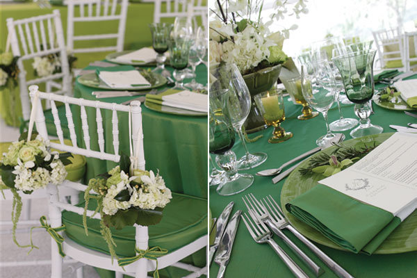
Without further adieu, we present Emerald in all it’s glory:


According to the Pantone Institute:
Emerald is a vivid, verdant green; it enhances our sense of well-being further by inspiring insight, as well as promoting balance and harmony.
-Penny Frulla for Bridal Expo Chicago